How to Use the HTML Picture Element for Responsive Images in 2027
Master the HTML picture element: format selection (AVIF/WebP/JPEG), art direction, responsive breakpoints, and performance optimization for 2027.
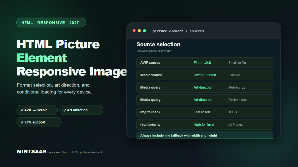
How to Use the HTML Picture Element for Responsive Images in 2027
Quick answer: The HTML<picture>element lets you serve different images based on browser capabilities (format support) and viewport size. Use<source>elements withmediaqueries for art direction (different crops for mobile vs desktop) andtypeattributes for format selection (AVIF → WebP → JPEG). Always include a fallback<img>element. The<picture>element is supported by 98%+ of browsers in 2027.[1][3][5]
The <picture> element is the most powerful tool in the responsive images toolkit. Unlike srcset (which only handles resolution switching), <picture> handles both format selection (serving AVIF to browsers that support it, WebP to others, JPEG as fallback) and art direction (serving different image crops for mobile vs desktop).
This guide covers every use case for the <picture> element: format selection, art direction, responsive breakpoints, and performance optimization.
Why use <picture> instead of just <img>?
The standard <img> element with srcset handles resolution switching (serving different sizes of the same image). But it cannot:
- Serve different formats. You can't tell the browser "use AVIF if supported, otherwise WebP, otherwise JPEG" with just
<img>. - Art direction. You can't tell the browser "use a 16:9 crop for desktop, a 1:1 crop for mobile" with just
<img>. - Conditional loading. You can't tell the browser "only load this image on screens wider than 768px" with just
<img>.
The <picture> element solves all three problems.[1][3]
Basic syntax
<picture>
  <source srcset="image.avif" type="image/avif">
  <source srcset="image.webp" type="image/webp">
  <img src="image.jpg" alt="Description" width="800" height="600">
</picture>
How it works:
- The browser evaluates
<source>elements in order - For each source, it checks if the
typeis supported - The first supported source is used
- If no source is supported, the
<img>fallback is used - The
<img>element provides alt text, dimensions, and loading attributes[1]
Use case 1: Format selection
Serve modern formats with automatic fallback:
<picture>
  <source srcset="product.avif" type="image/avif">
  <source srcset="product.webp" type="image/webp">
  <img src="product.jpg" alt="Product name" width="800" height="800" loading="lazy">
</picture>
Result: Browsers that support AVIF download the AVIF (smallest). Browsers that support WebP but not AVIF download the WebP. Older browsers download the JPEG.
This is the most common use of <picture> and provides 25–50% file size reduction for all users.[1][3]
With responsive sizes
<picture>
  <source
    srcset="product-400.avif 400w, product-800.avif 800w, product-1200.avif 1200w"
    sizes="(max-width: 600px) 100vw, 50vw"
    type="image/avif">
  <source
    srcset="product-400.webp 400w, product-800.webp 800w, product-1200.webp 1200w"
    sizes="(max-width: 600px) 100vw, 50vw"
    type="image/webp">
  <img
    src="product-800.jpg"
    srcset="product-400.jpg 400w, product-800.jpg 800w, product-1200.jpg 1200w"
    sizes="(max-width: 600px) 100vw, 50vw"
    alt="Product name"
    width="800"
    height="800"
    loading="lazy">
</picture>
This combines format selection (AVIF → WebP → JPEG) with resolution switching (400w, 800w, 1200w) for each format. The browser selects the best format and size.[1][3]
Use case 2: Art direction
Serve different image crops for different viewports:
<picture>
  <!-- Mobile: square crop -->
  <source media="(max-width: 600px)" srcset="hero-mobile.webp">
  <!-- Tablet: 4:3 crop -->
  <source media="(max-width: 1024px)" srcset="hero-tablet.webp">
  <!-- Desktop: 16:9 crop -->
  <img src="hero-desktop.webp" alt="Hero image" width="1920" height="1080">
</picture>
How it works: The browser evaluates media queries in order. The first matching source is used. If no media query matches, the <img> fallback is used.
Art direction use cases:
- Different crops for mobile (square) vs desktop (wide)
- Different compositions (close-up on mobile, wide shot on desktop)
- Different text overlays (larger text on mobile)
- Different focal points (centered on mobile, rule-of-thirds on desktop)[1][3]
Art direction with format selection
Combine art direction and format selection:
<picture>
  <!-- Mobile: AVIF -->
  <source media="(max-width: 600px)" srcset="hero-mobile.avif" type="image/avif">
  <source media="(max-width: 600px)" srcset="hero-mobile.webp" type="image/webp">
  <!-- Desktop: AVIF -->
  <source media="(min-width: 601px)" srcset="hero-desktop.avif" type="image/avif">
  <source media="(min-width: 601px)" srcset="hero-desktop.webp" type="image/webp">
  <!-- Fallback -->
  <img src="hero-desktop.jpg" alt="Hero" width="1920" height="1080" loading="eager" fetchpriority="high">
</picture>
Order matters: Put more specific sources first (mobile before desktop). The browser uses the first matching source.[1]
Use case 3: Conditional loading
Load different images based on device capabilities or preferences:
Dark mode
<picture>
  <source media="(prefers-color-scheme: dark)" srcset="logo-dark.webp">
  <img src="logo-light.webp" alt="Logo" width="200" height="60">
</picture>
High-DPI displays
<picture>
  <source media="(min-resolution: 2dppx)" srcset="logo-2x.webp">
  <img src="logo-1x.webp" alt="Logo" width="200" height="60">
</picture>
Print media
<picture>
  <source media="print" srcset="chart-print.png">
  <img src="chart-screen.webp" alt="Chart" width="800" height="400">
</picture>
Use case 4: LCP optimization
For the hero image (LCP element), use <picture> with priority loading:
<picture>
  <source srcset="hero.avif" type="image/avif">
  <source srcset="hero.webp" type="image/webp">
  <img src="hero.jpg" alt="Hero" width="1920" height="1080" fetchpriority="high">
</picture>
Key points:
- Use
fetchpriority="high"on the<img>(not on<source>) - Do NOT use
loading="lazy"on the hero image - Include
widthandheightto prevent CLS - Place the
<picture>element early in the HTML (above other resources)[4]
Common mistakes
Forgetting the <img> fallback. The <img> element is required inside <picture>. Without it, no image will display in browsers that don't support <picture> or when no <source> matches.[1]
Putting attributes on <source> instead of <img>. Attributes like alt, width, height, loading, and fetchpriority go on the <img>, not on <source>. The <source> element only accepts srcset, sizes, media, and type.[1]
Wrong order of sources. Sources are evaluated in order. Put the most specific or most preferred source first. For format selection: AVIF → WebP → (fallback img). For art direction: most specific media query first.[1]
Using src on <source>. The <source> element uses srcset, not src. Using src on <source> is invalid and will be ignored.[1]
Not including sizes with w descriptors. When using srcset with width descriptors (400w, 800w), you must include sizes to tell the browser the display width. Without sizes, the browser assumes 100vw.[3]
Missing width and height on <img>. Without dimensions, the browser can't reserve space for the image, causing layout shift (CLS) when the image loads.[4]
Performance best practices
1. Preload the hero image. Add a preload hint in the <head>:
<link rel="preload" as="image" href="hero.webp" type="image/webp">For multiple formats:
<link rel="preload" as="image" href="hero.avif" type="image/avif">2. Use fetchpriority correctly. Set fetchpriority="high" on the hero image's <img>. Set fetchpriority="low" on below-the-fold images.[4]
3. Avoid nested <picture> elements. Nesting <picture> inside <picture> is invalid and causes unpredictable behavior.[1]
4. Test in multiple browsers. Verify that each browser loads the correct format. Use Chrome DevTools Network tab to check which image was downloaded.[4]
Framework support
Next.js
Next.js Image component generates <picture> automatically:
import Image from 'next/image';

<Image src="/product.jpg" alt="Product" width={800} height={800} />
// Generates <picture> with AVIF/WebP sources automatically
Astro
Astro's Image component supports <picture>:
---
import { Picture } from 'astro:assets';
import productImg from '../assets/product.jpg';
---
<Picture src={productImg} formats={['avif', 'webp']} alt="Product" />
HTML (manual)
For static sites, write the <picture> element manually as shown in the examples above.
Frequently Asked Questions (FAQ)
What is the HTML picture element?
The <picture> element is an HTML container that lets you serve different images based on browser capabilities (format support) and viewport conditions (media queries). It contains <source> elements for alternative images and an <img> element as fallback.[1]
When should I use <picture> vs <img> with srcset?
Use <picture> when you need format selection (AVIF → WebP → JPEG) or art direction (different crops for different viewports). Use <img> with srcset when you only need resolution switching (same image, different sizes). For most web images, <picture> with both format selection and resolution switching is the best approach.[1][3]
Does <picture> work with lazy loading?
Yes. Add loading="lazy" to the <img> element inside <picture>. The browser will defer loading the selected image until it's about to enter the viewport. The loading attribute on <source> is not supported.[3]
Can I use <picture> for background images?
No. <picture> is for content images (<img>). For background images, use CSS image-set() or JavaScript Intersection Observer. CSS image-set() provides similar format selection for background images.[1][3]
What is art direction in responsive images?
Art direction means serving different image crops or compositions for different viewports. For example, a wide landscape image on desktop might be cropped to a square on mobile to ensure the subject is visible. Use <picture> with media queries on <source> elements for art direction.[1][3]
Does <picture> affect SEO?
Yes, positively. <picture> enables serving modern formats (WebP/AVIF) that load faster, improving Core Web Vitals (especially LCP). Faster pages rank higher. Additionally, the <img> fallback ensures search engine crawlers can always access the image.[4]
How do I test if <picture> is working?
Open Chrome DevTools → Network tab → Filter by "Img". Reload the page. Check which image file was downloaded. Test in different browsers (Chrome, Firefox, Safari) to verify format selection. Use responsive design mode to test different viewport sizes.[4]
What is the browser support for <picture>?
The <picture> element is supported by 98%+ of browsers in 2027. All modern browsers (Chrome, Firefox, Safari, Edge) support it. The only browsers without support are very old versions (IE 11 and below), which fall back to the <img> element.[1]
Related reading on MintSaaS
- How to Optimize Images for Mobile: Responsive Image Guide for 2027
- How to Convert Images Between Formats: The Complete Guide to WebP, AVIF, JPEG, and PNG in 2027
- WebP vs AVIF: Which Image Format Wins in 2027?
- Image Lazy Loading: Implementation Guide for Web Performance in 2027
- Image CDN vs Self-Hosted: Which Is Better for Performance in 2027?
- SVG Optimization: How to Reduce Vector File Size for Web in 2027
- Lossless vs Lossy Compression: When to Use Each for Images in 2027
- How to Batch Compress Images Online: Bulk Workflow Guide for 2027
- Image Optimization for E-Commerce: Product Photos That Convert in 2027
- How to Resize Images for Social Media: Platform-Specific Guide for 2027
- How to Optimize Images for SEO: Complete Guide to Faster Loading and Higher Rankings
- Best Image Compression Tools for Web Developers in 2027
- PDF Security: How to Protect Sensitive Documents Online in 2027
- How to Compress Images Without Losing Quality: The Complete 2027 Guide
- How to Grow on Instagram in 2027: A Practical Growth Guide
Sources
[1] MDN Web Docs — The Picture element: https://developer.mozilla.org/en-US/docs/Web/HTML/Element/picture
[2] MDN Web Docs — Responsive images: https://developer.mozilla.org/en-US/docs/Learn/HTML/Multimedia_and_embedding/Responsive_images
[3] Image Optimization for the Web (boxtool.app): https://boxtool.app/en/guides/image-optimization-for-web/
[4] Web.dev — Core Web Vitals: https://web.dev/vitals/
[5] MintSaaS Image Compressor: https://www.mintsaas.net/products/image-compressor
Free tools on MintSaaS
Try our free tools to put this guide into practice:
MintSaaS Dispatch articles are researched and synthesized with the assistance of artificial intelligence analysis, then edited, verified, and benchmarked by our engineering editorial team. Customer personal data and platform source files are strictly segregated and are never used to train or fine-tune public artificial intelligence models.
More from MintSaaS Dispatch
Handcrafted technical insights and developer tools.