How to Optimize Images for Mobile: Responsive Image Guide for 2027
Optimize images for mobile: responsive images (srcset/sizes), modern formats, lazy loading, and Core Web Vitals. Reduce bandwidth by 88% on mobile devices.
How to Optimize Images for Mobile: Responsive Image Guide for 2027
Quick answer: To optimize images for mobile, serve smaller images using responsive images (srcset/sizes), use modern formats (WebP/AVIF), compress to quality 75–80, implement lazy loading, use CSS image-set() for background images, avoid fixed-width images, test on real mobile devices, and monitor Core Web Vitals (especially LCP) on mobile. Mobile users on 3G/4G connections benefit most from image optimization — a 1 MB image takes 8+ seconds on 3G.[1][3][4]
Mobile traffic accounts for over 60% of web traffic in 2027, yet most websites still serve desktop-sized images to mobile devices. A 1920×1080 hero image served to a 375px-wide phone wastes 96% of the bandwidth. This wastes data, slows page loading, and frustrates users.
Mobile image optimization is not just about making images smaller — it's about serving the right image for each device, viewport, and connection speed. This guide covers the complete mobile image optimization workflow.
Why mobile image optimization matters
Mobile users face unique constraints:
- Smaller screens: A 375px-wide phone doesn't need a 1920px image
- Slower connections: 3G/4G is 10–100× slower than broadband
- Data caps: Mobile users pay for data; large images consume their allowance
- Battery life: Downloading and decoding large images drains battery
- Touch interfaces: Users pinch-to-zoom, requiring higher resolution on demand[4]
The impact of mobile image optimization:
- Page load time: Reducing image size by 70% can cut mobile load time from 8s to 2.5s
- Core Web Vitals: LCP improves dramatically with smaller images
- Bounce rate: 53% of mobile users abandon sites that take >3s to load
- Conversion rate: 1s faster load = 7% more conversions[4]
Responsive images: the foundation
Responsive images serve different image files based on the device's viewport size, pixel density, and format support. The HTML srcset and sizes attributes are the standard approach.
srcset and sizes
<img
  srcset="product-400.webp 400w,
          product-800.webp 800w,
          product-1200.webp 1200w,
          product-1920.webp 1920w"
  sizes="(max-width: 600px) 100vw,
         (max-width: 1024px) 50vw,
         33vw"
  src="product-800.webp"
  alt="Product name"
  width="800"
  height="800"
  loading="lazy"
>
How it works:
- The browser reads
sizesto determine the display width of the image - The browser reads
srcsetto find the smallest image that is ≥ the display width × device pixel ratio - The browser downloads that image
Example: On a 375px-wide phone with 2× pixel density, the display width is 375px but the required resolution is 750px. The browser selects product-800.webp (the smallest image ≥ 750px).[3]
Device pixel ratio (DPR)
High-DPI displays (Retina, etc.) have 2× or 3× pixel density. A 400px-wide image on a 2× display needs 800px of actual pixels. The srcset with w descriptors handles this automatically — the browser multiplies the display width by the DPR.[3]
For explicit DPR targeting:
<img
  srcset="image-1x.webp 1x,
          image-2x.webp 2x,
          image-3x.webp 3x"
  src="image-1x.webp"
  alt="Description"
>
The <picture> element for format selection
Use <picture> to serve modern formats with fallbacks:
<picture>
  <source
    srcset="image-400.avif 400w, image-800.avif 800w, image-1200.avif 1200w"
    sizes="(max-width: 600px) 100vw, 50vw"
    type="image/avif">
  <source
    srcset="image-400.webp 400w, image-800.webp 800w, image-1200.webp 1200w"
    sizes="(max-width: 600px) 100vw, 50vw"
    type="image/webp">
  <img
    src="image-800.jpg"
    alt="Description"
    width="800"
    height="600"
    loading="lazy">
</picture>
The browser selects the first format it supports (AVIF → WebP → JPEG) and the appropriate size from srcset.[1][3]
Mobile-specific optimization techniques
1. Serve smaller images for mobile
The most impactful optimization. Use srcset with width descriptors to serve appropriately sized images:
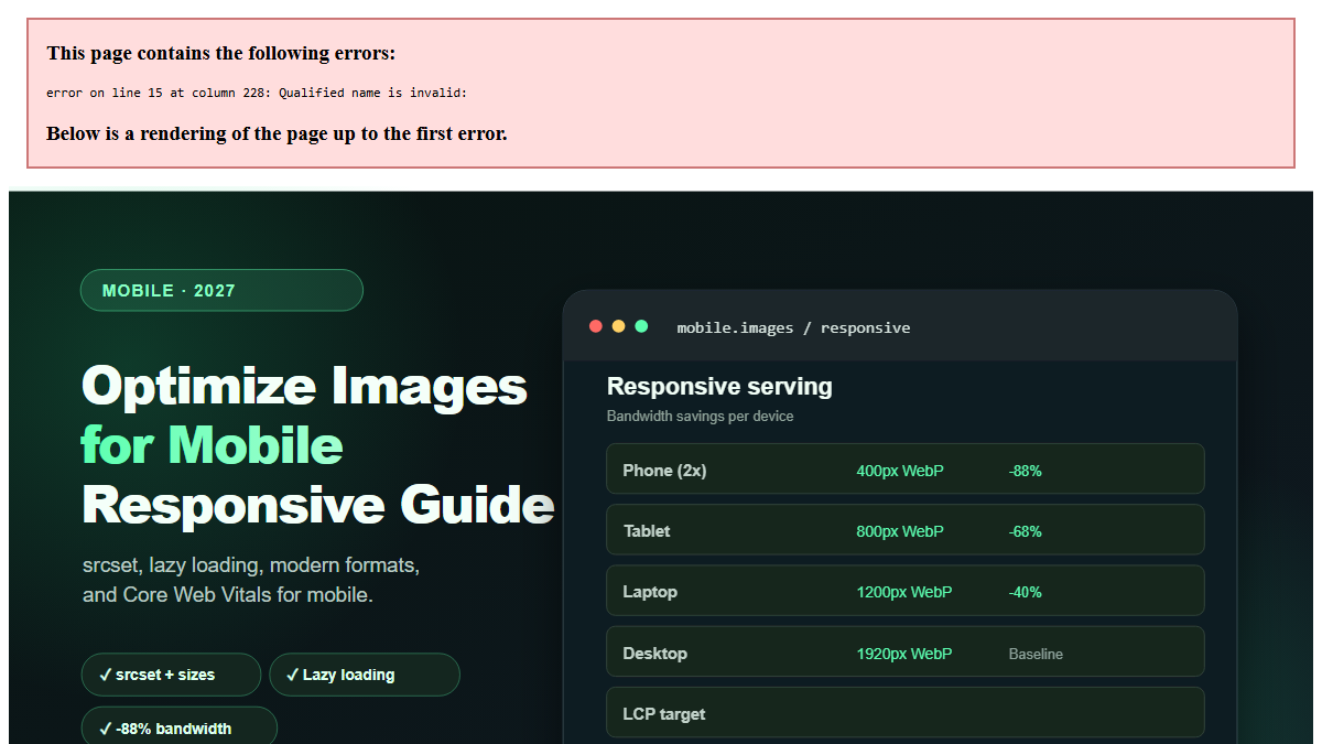
| Viewport | Image width | File size (WebP Q80) |
|---|---|---|
| 375px (phone) | 400px | ~30 KB |
| 768px (tablet) | 800px | ~80 KB |
| 1024px (laptop) | 1200px | ~150 KB |
| 1920px (desktop) | 1920px | ~250 KB |
A phone downloading a 400px image instead of a 1920px image saves 88% of bandwidth.[3]
2. Use modern formats
WebP and AVIF are 25–50% smaller than JPEG at equivalent quality. On mobile, where bandwidth is limited, this difference is significant. Serve WebP (97% support) or AVIF (90% support) with JPEG fallback.[1][3]
3. Compress aggressively for mobile
Mobile users are more tolerant of slight quality reduction in exchange for faster loading. Consider using quality 75 (instead of 80) for mobile-specific images. The file size reduction is ~20% with minimal visible difference on small screens.[3]
4. Implement lazy loading
Lazy loading defers image loading until the image is about to enter the viewport. On mobile, where users scroll quickly, this prevents loading images that the user may never see.
<img src="image.webp" loading="lazy" alt="Description" width="400" height="300">Critical: Never lazy-load the hero image or LCP element. Use fetchpriority="high" for above-the-fold images.[4]
5. Use CSS image-set() for background images
For CSS background images, use image-set() to serve different resolutions:
.hero {
  background-image: image-set(
    url('hero-400.webp') 1x,
    url('hero-800.webp') 2x
  );
  background-size: cover;
}
6. Avoid fixed-width images
Never use fixed pixel widths for images in responsive layouts. Use relative units (%, vw, rem) or CSS max-width: 100% to ensure images scale with the viewport.[3]
img {
  max-width: 100%;
  height: auto;
}
7. Optimize for slow connections
Use the Network Information API to detect connection speed and serve appropriate images:
const connection = navigator.connection || navigator.mozConnection || navigator.webkitConnection;
if (connection && connection.effectiveType === '3g') {
  // Serve lower quality images
  img.src = 'image-low.webp';
} else {
  img.src = 'image-high.webp';
}
8. Use image CDNs with device detection
Image CDNs (Cloudflare Images, Cloudinary, imgix) can automatically detect the device and serve the optimal image size and format. This eliminates the need for manual srcset configuration.[5]
Mobile performance targets
| Metric | Target | Why |
|---|---|---|
| LCP (Largest Contentful Paint) | < 2.5s | Google ranking factor |
| Total page weight | < 1 MB | Mobile data constraints |
| Image load time | < 1s per image | User experience |
| CLS (Cumulative Layout Shift) | < 0.1 | Prevent layout jumps |
| Time to Interactive | < 3.8s | User engagement |
Testing on mobile
Chrome DevTools Device Mode: Simulate mobile viewports and throttled connections. Use "Slow 3G" or "Fast 3G" presets.[4]
Real device testing: Always test on actual mobile devices. Emulators don't perfectly replicate real-world performance. Test on:
- Low-end Android (2 GB RAM)
- Mid-range iPhone
- Tablet (iPad)
Lighthouse Mobile Audit: Run Lighthouse with mobile settings. Check the "Opportunities" section for image optimization suggestions.[4]
PageSpeed Insights: Test your URL with PageSpeed Insights. It provides mobile-specific Core Web Vitals scores and recommendations.[4]
Common mobile image mistakes
Serving desktop images to mobile. A 1920px image on a 375px phone wastes 96% of bandwidth. Always use responsive images.[3]
Not accounting for DPR. A 400px display width on a 2× display needs 800px of actual pixels. The srcset with w descriptors handles this, but manual sizing doesn't.[3]
Lazy-loading the hero image. This delays LCP and hurts mobile rankings. Use fetchpriority="high" for above-the-fold images.[4]
Using fixed-width images. width="1920" without max-width: 100% causes horizontal scrolling on mobile. Always make images responsive.[3]
Ignoring connection speed. A 500 KB image on 3G takes 4+ seconds to load. Use the Network Information API to serve lower-quality images on slow connections.[4]
Not testing on real devices. Emulators don't replicate real-world performance. Test on actual mobile devices with throttled connections.[4]
Frequently Asked Questions (FAQ)
How do I make images responsive for mobile?
Use the srcset and sizes attributes on <img> tags. Provide multiple image sizes (400w, 800w, 1200w, 1920w) and let the browser choose the appropriate size based on viewport and device pixel ratio. Always include width and height attributes to prevent layout shift.[3]
What image size should I serve to mobile devices?
Serve 400–800px wide images to mobile devices. A 375px-wide phone with 2× DPR needs 750px of actual pixels, so 800px is ideal. For tablets, serve 800–1024px. Use srcset to automate this.[3]
Should I use different image formats for mobile?
Use the same format strategy for mobile and desktop: WebP or AVIF with JPEG fallback. Modern formats are even more important on mobile where bandwidth is limited. The <picture> element handles format selection automatically.[1][3]
How do I test image performance on mobile?
Use Chrome DevTools Device Mode with throttled connections (Slow 3G/Fast 3G). Run Lighthouse with mobile settings. Test on real mobile devices. Use PageSpeed Insights for mobile-specific Core Web Vitals scores.[4]
What is the Network Information API?
The Network Information API (navigator.connection) provides information about the user's connection (effective type: 4g, 3g, 2g, slow-2g). You can use it to serve lower-quality images on slow connections. Browser support is ~75%.[4]
How do I prevent layout shift from images on mobile?
Always include width and height attributes on <img> tags. Use CSS aspect-ratio for responsive images. Reserve space for images before they load. This prevents CLS (Cumulative Layout Shift), which is a Core Web Vital.[4]
Should I use lazy loading on mobile?
Yes, for below-the-fold images. Use loading="lazy" for images that are not visible on initial load. Never lazy-load the hero image or above-the-fold content. Mobile users scroll quickly, so lazy loading saves significant bandwidth.[4]
How much can mobile image optimization improve load time?
Typical improvements: 50–70% reduction in image file sizes, 40–60% reduction in page load time, and 30–50% improvement in LCP scores. For a site with 5 MB of images on mobile, optimization can reduce it to 1.5 MB, cutting load time from 8s to 2.5s on 4G.[3][4]
Related reading on MintSaaS
- How to Optimize Images for SEO: Complete Guide to Faster Loading and Higher Rankings
- How to Compress Images Without Losing Quality: The Complete 2027 Guide
- How to Convert Images Between Formats: The Complete Guide to WebP, AVIF, JPEG, and PNG in 2027
- How to Resize Images for Social Media: Platform-Specific Guide for 2027
- SVG Optimization: How to Reduce Vector File Size for Web in 2027
- Lossless vs Lossy Compression: When to Use Each for Images in 2027
- How to Batch Compress Images Online: Bulk Workflow Guide for 2027
- Image Optimization for E-Commerce: Product Photos That Convert in 2027
- WebP vs AVIF: Which Image Format Wins in 2027?
- Best Image Compression Tools for Web Developers in 2027
- PDF Security: How to Protect Sensitive Documents Online in 2027
- How to Grow on Instagram in 2027: A Practical Growth Guide
- Image CDN vs Self-Hosted: Which Is Better for Performance in 2027?
- How to Use the HTML Picture Element for Responsive Images in 2027
- Image Lazy Loading: Implementation Guide for Web Performance in 2027
Sources
[1] MDN Web Docs — Responsive images: https://developer.mozilla.org/en-US/docs/Learn/HTML/Multimedia_and_embedding/Responsive_images
[2] MDN Web Docs — Image file type and format guide: https://developer.mozilla.org/en-US/docs/Web/Media/Guides/Formats/Image_types
[3] Image Optimization for the Web (boxtool.app): https://boxtool.app/en/guides/image-optimization-for-web/
[4] Web.dev — Core Web Vitals: https://web.dev/vitals/
[5] MintSaaS Image Compressor: https://www.mintsaas.net/products/image-compressor
Free tools on MintSaaS
Try our free tools to put this guide into practice:
MintSaaS Dispatch articles are researched and synthesized with the assistance of artificial intelligence analysis, then edited, verified, and benchmarked by our engineering editorial team. Customer personal data and platform source files are strictly segregated and are never used to train or fine-tune public artificial intelligence models.
More from MintSaaS Dispatch
Handcrafted technical insights and developer tools.