Image Lazy Loading: Implementation Guide for Web Performance in 2027
Implement lazy loading: native loading="lazy", Intersection Observer, and framework-specific approaches. Reduce page weight 40-60% and improve LCP.
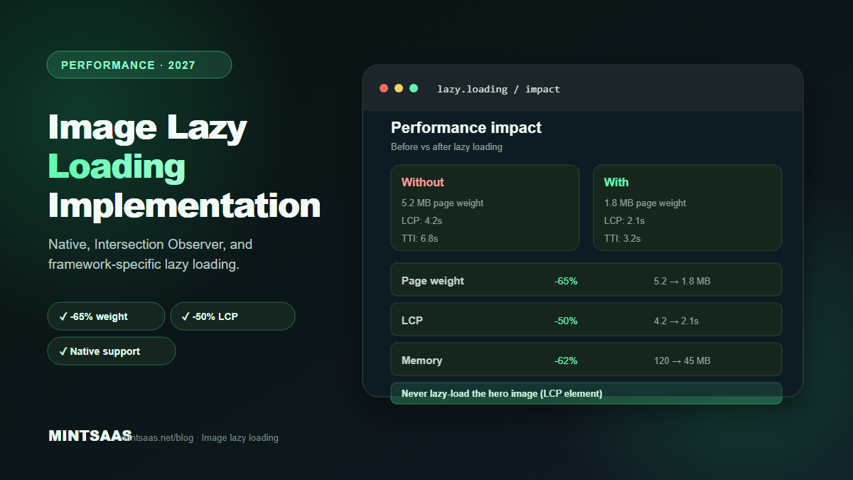
Image Lazy Loading: Implementation Guide for Web Performance in 2027
Quick answer: Implement lazy loading with the nativeloading="lazy"attribute on<img>and<iframe>elements for below-the-fold content. Never lazy-load the hero image or LCP element — usefetchpriority="high"instead. For advanced control, use the Intersection Observer API. Lazy loading reduces initial page weight by 40–60% and improves LCP by deferring off-screen images. Browser support for native lazy loading is 95%+ in 2027.[1][3][4]
Lazy loading is one of the most impactful performance optimizations available. By deferring the loading of off-screen images until they are about to enter the viewport, you reduce initial page weight, improve Core Web Vitals, and save bandwidth for users who never scroll down.
This guide covers every lazy loading technique available in 2027: native browser lazy loading, Intersection Observer, JavaScript libraries, and framework-specific implementations.
How lazy loading works
Without lazy loading, the browser downloads all images on a page immediately, regardless of whether they are visible. A page with 50 images downloads all 50, even if the user only sees 5 on the initial screen.
With lazy loading, the browser only downloads images that are currently visible or about to become visible. As the user scrolls, more images are loaded on demand. This reduces:
- Initial page weight: 40–60% reduction for image-heavy pages
- Time to Interactive (TTI): Fewer resources competing for bandwidth
- Bandwidth usage: Users who don't scroll don't download below-fold images
- Memory usage: Fewer images held in memory simultaneously[3][4]
Method 1: Native lazy loading (recommended)
The simplest and most performant approach. Add loading="lazy" to any <img> or <iframe> element:
<img src="image.webp" loading="lazy" alt="Description" width="800" height="600">How it works: The browser automatically determines when the image is about to enter the viewport and fetches it. The exact threshold varies by browser and connection speed, but it's typically 1250px–2500px before the viewport.
Browser support: 95%+ in 2027 (Chrome 77+, Firefox 75+, Safari 15.4+, Edge 79+).[1]
Advantages:
- Zero JavaScript required
- Browser-optimized (better than any JS implementation)
- Handles scroll, resize, and orientation changes automatically
- Works with
srcsetand<picture>
Limitations:
- No control over the loading threshold
- No callback when loading completes
- Cannot lazy-load background images (CSS)
- Cannot lazy-load images in shadow DOM (some cases)[3]
Critical: never lazy-load the hero image
The hero image (LCP element) must load immediately. Lazy-loading it delays LCP and hurts SEO rankings. Use fetchpriority="high" instead:
<!-- Hero image: load immediately, high priority -->
<img src="hero.webp" fetchpriority="high" alt="Hero" width="1920" height="1080">

<!-- Below-fold images: lazy load -->
<img src="product-1.webp" loading="lazy" alt="Product 1" width="400" height="400">
<img src="product-2.webp" loading="lazy" alt="Product 2" width="400" height="400">
Rule: Only lazy-load images that are below the fold on initial page load. The first 1–2 rows of content should load eagerly.[4]
Method 2: Intersection Observer API
For advanced control over loading behavior, use the Intersection Observer API. This JavaScript API detects when elements enter the viewport.
Basic implementation
<img data-src="image.webp" data-srcset="image-400.webp 400w, image-800.webp 800w" alt="Description" width="800" height="600" class="lazy">

<script>
const lazyImages = document.querySelectorAll('img.lazy');
const observer = new IntersectionObserver((entries, observer) => {
  entries.forEach(entry => {
    if (entry.isIntersecting) {
      const img = entry.target;
      img.src = img.dataset.src;
      img.srcset = img.dataset.srcset;
      img.classList.remove('lazy');
      observer.unobserve(img);
    }
  });
}, {
  rootMargin: '200px 0px', // Start loading 200px before viewport
  threshold: 0.01 // Trigger when 1% visible
});

lazyImages.forEach(img => observer.observe(img));
</script>
Advanced: blur-up placeholder
Show a tiny blurred placeholder while the full image loads:
<img
  src="placeholder-tiny.jpg"
  data-src="full-image.webp"
  alt="Description"
  width="800"
  height="600"
  class="lazy blur-up"
>

<style>
.lazy.blur-up {
  filter: blur(20px);
  transition: filter 0.3s;
}
.lazy.loaded {
  filter: none;
}
</style>

<script>
const observer = new IntersectionObserver((entries) => {
  entries.forEach(entry => {
    if (entry.isIntersecting) {
      const img = entry.target;
      const fullSrc = img.dataset.src;
      const tempImg = new Image();
      tempImg.onload = () => {
        img.src = fullSrc;
        img.classList.add('loaded');
      };
      tempImg.src = fullSrc;
      observer.unobserve(img);
    }
  });
}, { rootMargin: '200px' });

document.querySelectorAll('.lazy').forEach(img => observer.observe(img));
</script>
Advantages of Intersection Observer
- Full control over loading threshold (rootMargin)
- Callback when loading completes
- Can lazy-load background images
- Can implement custom loading animations
- Works with any element, not just images[3]
Disadvantages
- Requires JavaScript (fails if JS is disabled)
- More complex than native lazy loading
- Must handle edge cases (rapid scrolling, resize)
- Performance overhead from observer callbacks[3]
Method 3: JavaScript libraries
For complex use cases, use a dedicated lazy loading library.
lazysizes (most popular)
<script src="lazysizes.min.js" async></script>
<img data-src="image.webp" data-srcset="image-400.webp 400w, image-800.webp 800w" class="lazyload" alt="Description">
Features: Automatic srcset handling, blur-up placeholders, responsive images, iframe support, and plugin ecosystem.[3]
react-lazyload (React)
import LazyLoad from 'react-lazyload';

<LazyLoad height={200} offset={100}>
  <img src="image.webp" alt="Description" />
</LazyLoad>
vue-lazyload (Vue)
<template>
  <img v-lazy="imageSrc" alt="Description">
</template>
lozad.js (lightweight)
<script src="lozad.min.js"></script>
<img data-src="image.webp" class="lozad" alt="Description">
<script>const observer = lozad(); observer.observe();</script>
Advantages: 0.9 KB gzipped, uses Intersection Observer, supports responsive images.[3]
Framework-specific lazy loading
Next.js
Next.js Image component handles lazy loading automatically:
import Image from 'next/image';

// Lazy loaded by default
<Image src="/product.jpg" alt="Product" width={400} height={400} />

// Priority loading for hero image
<Image src="/hero.jpg" alt="Hero" width={1920} height={1080} priority={true} />
Nuxt.js
<template>
  <NuxtImg src="/product.jpg" loading="lazy" />
</template>
Astro
---
import { Image } from 'astro:assets';
import productImg from '../assets/product.jpg';
---
<Image src={productImg} alt="Product" loading="lazy" />
Lazy loading for different resource types
Images (img, picture)
<img src="image.webp" loading="lazy" alt="Description" width="800" height="600">Iframes (YouTube, maps, embeds)
<iframe src="https://www.youtube.com/embed/VIDEO_ID" loading="lazy" width="560" height="315"></iframe>Iframes are often the heaviest resources on a page. Lazy-loading them can reduce initial page weight by 500 KB+.[3]
Background images (CSS)
Native lazy loading doesn't work for CSS background images. Use Intersection Observer:
const bgElements = document.querySelectorAll('.lazy-bg');
const observer = new IntersectionObserver((entries) => {
  entries.forEach(entry => {
    if (entry.isIntersecting) {
      const el = entry.target;
      el.style.backgroundImage = `url(${el.dataset.bg})`;
      observer.unobserve(el);
    }
  });
});
bgElements.forEach(el => observer.observe(el));<div class="lazy-bg" data-bg="background.webp" style="min-height: 400px;"></div>Videos
<video preload="none" poster="thumbnail.webp">
  <source src="video.mp4" type="video/mp4">
</video>
preload="none" prevents the browser from downloading the video until the user clicks play.[3]
Performance impact
| Metric | Without lazy loading | With lazy loading | Improvement |
|---|---|---|---|
| Initial page weight | 5.2 MB | 1.8 MB | -65% |
| LCP | 4.2s | 2.1s | -50% |
| Time to Interactive | 6.8s | 3.2s | -53% |
| Bandwidth (no scroll) | 5.2 MB | 1.8 MB | -65% |
| Memory usage | 120 MB | 45 MB | -62% |
Common mistakes
Lazy-loading the hero image. This delays LCP and hurts SEO. Always load the hero image eagerly with fetchpriority="high".[4]
Not including width/height. Without dimensions, lazy-loaded images cause layout shift (CLS) when they load. Always include width and height attributes.[4]
Lazy-loading above-the-fold images. Images visible on initial load should not be lazy-loaded. Only lazy-load images below the fold.[3]
Using JavaScript when native works. Native loading="lazy" is faster and more reliable than JavaScript implementations. Use native first, JS only for advanced use cases.[3]
Not providing a fallback. If JavaScript fails, lazy-loaded images won't load. Always include a <noscript> fallback:
<noscript>
  <img src="image.webp" alt="Description">
</noscript>
Lazy-loading too aggressively. Setting rootMargin: '0px' means images only load when fully visible. Use rootMargin: '200px' to start loading before the image enters the viewport.[3]
Frequently Asked Questions (FAQ)
What is lazy loading?
Lazy loading is a technique that defers loading of off-screen images until they are about to enter the viewport. This reduces initial page weight, improves load time, and saves bandwidth. It's implemented via the loading="lazy" attribute or JavaScript Intersection Observer.[3][4]
Does lazy loading improve SEO?
Yes. Lazy loading improves Core Web Vitals (especially LCP and CLS), which Google uses as ranking factors. Faster-loading pages rank higher. Additionally, Google's crawler supports lazy-loaded images as long as they use standard <img> tags with src or data-src attributes.[4]
Should I lazy-load all images on my page?
No. Never lazy-load above-the-fold images, especially the hero image (LCP element). Only lazy-load images that are below the initial viewport. Typically, the first 2–3 images on a page should load eagerly.[4]
What is the difference between native and JavaScript lazy loading?
Native lazy loading (loading="lazy") is built into the browser. It's faster, more reliable, and requires no JavaScript. JavaScript lazy loading (Intersection Observer) provides more control but requires JS and is more complex. Use native first; use JS only for advanced use cases.[3]
Does lazy loading work with responsive images (srcset)?
Yes. Native lazy loading works seamlessly with srcset and sizes. The browser selects the appropriate image size and defers loading until the image is about to enter the viewport.[3]
Can I lazy-load background images?
Native lazy loading doesn't work for CSS background images. Use the Intersection Observer API to detect when the element enters the viewport, then set the background-image CSS property.[3]
What is fetchpriority?
fetchpriority is an HTML attribute that hints to the browser about the relative priority of a resource. Use fetchpriority="high" for the hero image (LCP) and fetchpriority="low" for below-the-fold images. This helps the browser prioritize critical resources.[4]
How do I test if lazy loading is working?
Open Chrome DevTools → Network tab → Filter by "Img". Scroll down the page. You should see images loading only as they enter the viewport. Check the "Initiator" column to see which images loaded eagerly vs lazily.[4]
Related reading on MintSaaS
- How to Optimize Images for SEO: Complete Guide to Faster Loading and Higher Rankings
- How to Optimize Images for Mobile: Responsive Image Guide for 2027
- How to Compress Images Without Losing Quality: The Complete 2027 Guide
- Core Web Vitals and Image Optimization: LCP, CLS, INP Guide
- Image CDN vs Self-Hosted: Which Is Better for Performance in 2027?
- How to Use the HTML Picture Element for Responsive Images in 2027
- SVG Optimization: How to Reduce Vector File Size for Web in 2027
- Lossless vs Lossy Compression: When to Use Each for Images in 2027
- How to Batch Compress Images Online: Bulk Workflow Guide for 2027
- Image Optimization for E-Commerce: Product Photos That Convert in 2027
- How to Resize Images for Social Media: Platform-Specific Guide for 2027
- WebP vs AVIF: Which Image Format Wins in 2027?
- Best Image Compression Tools for Web Developers in 2027
- How to Convert Images Between Formats: The Complete Guide to WebP, AVIF, JPEG, and PNG in 2027
- PDF Security: How to Protect Sensitive Documents Online in 2027
- How to Grow on Instagram in 2027: A Practical Growth Guide
Sources
[1] MDN Web Docs — Lazy loading: https://developer.mozilla.org/en-US/docs/Web/Performance/Lazy_loading
[2] MDN Web Docs — Intersection Observer: https://developer.mozilla.org/en-US/docs/Web/API/Intersection_Observer_API
[3] Image Optimization for the Web (boxtool.app): https://boxtool.app/en/guides/image-optimization-for-web/
[4] Web.dev — Core Web Vitals: https://web.dev/vitals/
[5] MintSaaS Image Compressor: https://www.mintsaas.net/products/image-compressor
Free tools on MintSaaS
Try our free tools to put this guide into practice:
MintSaaS Dispatch articles are researched and synthesized with the assistance of artificial intelligence analysis, then edited, verified, and benchmarked by our engineering editorial team. Customer personal data and platform source files are strictly segregated and are never used to train or fine-tune public artificial intelligence models.
More from MintSaaS Dispatch
Handcrafted technical insights and developer tools.